Are you trying to choose a colour scheme for a new kitchen or renovation? With so many cabinet colours, stone patterns, wood tones and hardware finishes available, it can be difficult to know which combination will work in your home.
A good kitchen palette should look balanced in natural and artificial light. It should also connect with the flooring, adjoining rooms and architectural style of the house.
This guide explains how to choose kitchen colour schemes that feel personal without relying on short-lived trends or unsupported resale claims.
Quick answer
Start with the fixed materials, including flooring, countertops and major appliances. Choose one main cabinet colour, one supporting tone and a small number of accents. Test every finish together in your kitchen before approving the final palette.
A balanced kitchen colour scheme considers
- The amount and direction of natural light
- Cabinetry and island colours
- Countertop and backsplash patterns
- Flooring undertones
- Appliance and hardware finishes
- Lighting colour temperature
- Colours used in adjoining rooms
Why Kitchen Colour Schemes Matter
Colour affects how the individual parts of a kitchen relate to one another. Cabinets may take up most of the visual space, while countertops, flooring and walls provide supporting tones.
A coordinated palette can make the room feel calm and complete. A poorly coordinated palette may make good materials look disconnected, especially when several strong colours or patterns compete for attention.
The goal is not to make every surface match. A successful design usually combines enough repetition to create unity with enough contrast to keep the room interesting.
Think of the palette in three parts
Main colour
The dominant cabinetry, wall or flooring colour that defines the room.
Supporting colour
A complementary tone used on the island, backsplash, countertop or secondary cabinets.
Accent finish
A smaller detail such as hardware, lighting, stools or decorative accessories.
Warm, Cool and Neutral Kitchen Colours
One of the first things you should think about is whether the main materials have warm, cool or neutral undertones. This is often more important than the colour name printed on a sample.
Warm palette
Cream, Beige, Taupe and Warm Wood
Warm palettes can make a kitchen feel comfortable and welcoming. They often work well with oak, walnut, cream-coloured stone and brass or bronze details.
Avoid combining yellow-toned cabinets with a countertop that has a strong blue or icy-grey base unless the contrast is intentional.
Cool palette
Blue, Green, Cool Grey and Crisp White
Cool colours can create a clean and composed appearance. Navy, sage, muted blue and cooler greys may be paired with white stone, nickel or black accents.
Cool colours can appear different under warm evening lighting, so test the complete combination before ordering cabinetry.
Neutral palette
White, Greige, Charcoal and Natural Materials
Neutral kitchens provide a flexible base for stone, wood and metal finishes. They can feel warm or cool depending on the undertones and lighting.
Use texture to keep a neutral kitchen from feeling flat. Woodgrain, veined stone, handmade tile and matte finishes can add depth without adding another strong colour.
How Light Changes Kitchen Colours
The same cabinet sample can look different in a showroom, beside a window and under evening lighting. Natural light changes throughout the day, while artificial lighting can make a colour appear warmer, cooler, brighter or more muted.
North-facing rooms often receive cooler light. South- and west-facing rooms may receive stronger or warmer light during part of the day. Window size, nearby buildings and trees can also affect the result.
Your electrical lighting plan matters as well. Review our guide to kitchen lighting options before finalizing cabinet and wall colours.
Do not approve colours from a phone screen
Screens do not show paint, stone and wood colours accurately. Use physical samples and view them together in the actual kitchen during the morning, afternoon and evening.

Choosing Colours for Cabinets and Islands
Cabinetry usually has the greatest influence on the kitchen palette because it covers a large area and is expensive to replace. Choose a colour that works with the permanent materials rather than selecting it on its own.
One-Colour Cabinetry
Using one cabinet colour can create a calm and consistent appearance. Interest can be added through the countertop, backsplash, hardware and natural variation in the flooring.
This approach can work well in kitchens with detailed stone or flooring because it allows the patterned material to remain the main feature.
Two-Tone Cabinetry
Two-tone kitchens often use a different colour on the island or lower cabinets. The secondary colour should relate to another part of the room, such as the stone veining, floor tone or adjoining furniture.
Avoid dividing the room into several unrelated cabinet colours. One clear contrast is usually easier to coordinate than several competing finishes.
Natural Wood Cabinetry
Natural wood introduces colour through its grain and undertone. White oak may appear pale and calm, while walnut provides greater depth and contrast.
Compare the wood sample with the flooring to make sure the two finishes do not look unintentionally similar or visibly mismatched.
Coordinating Countertops and Backsplashes
Countertops and backsplashes can contain several colours within one material. Identify the background colour, veining and overall level of contrast before choosing the cabinets.
When the countertop has strong movement
- ✓ Keep the cabinet colour relatively simple.
- ✓ Repeat one colour from the stone elsewhere in the room.
- ✓ Use a quieter backsplash if the countertop is already a focal point.
- ✓ View the full stone slab rather than relying on a small sample.
When the countertop is quiet and consistent
- ✓ Consider a stronger cabinet or island colour.
- ✓ Add texture through tile or wood.
- ✓ Use hardware or lighting as a controlled accent.
- ✓ Keep the number of competing patterns limited.
Kitchen Colour Schemes for Different Spaces
Small Kitchens
Light colours can reflect more available light, but a small kitchen does not have to be completely white. A darker island, lower cabinets or pantry wall can add depth without covering every surface.
Keep strong patterns controlled and make sure the room has enough task lighting. A limited palette can help a compact kitchen feel organized.
Large Kitchens
A larger kitchen can support deeper colours and stronger contrasts. A dark island or bank of tall cabinets can help anchor a large open room.
Large spaces still need repetition. Carry the island colour into lighting, furniture, window frames or smaller details so it does not appear isolated.
Open-Concept Kitchens
An open kitchen should connect visually with the dining and living areas. This does not mean using the exact same colour on every wall and cabinet.
Repeat one or two tones, woods or metal finishes across the connected rooms. Review our comparison of open and closed kitchen layouts when planning how the kitchen will relate to the rest of the floor.
Kitchen Colour Combinations That Work Well
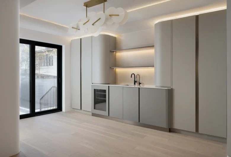
The following combinations can help point you in the right direction. Each palette should still be tested against your actual flooring, light and architectural details.
Warm White, Natural Oak and Brass
A comfortable palette that combines a light foundation with natural warmth and a controlled metallic accent.
Navy, Soft White and Brushed Nickel
A clear contrast that can work on an island or lower cabinets while keeping the perimeter lighter.
Muted Green, Cream and Walnut
An earthy combination that works well with warm stone, natural wood and soft lighting.
Charcoal, Greige and Warm Wood
A deeper neutral palette that can add contrast while remaining connected to natural flooring and furniture.
Off-White, Taupe and Matte Black
A simple neutral base with enough black contrast to define lighting, hardware and window details.
Common Kitchen Colour Mistakes
Choosing Every Finish Separately
A cabinet colour may look attractive on its own but clash with the flooring or countertop. Review the complete material group before approving any one item.
Using Too Many Strong Features
Bold cabinets, dramatic stone, patterned tile and statement flooring can compete when they are all used together. Decide which material should lead the design.
Ignoring Undertones
Two finishes may both be called grey or white but have noticeably different undertones. Compare them directly under the same lighting.
Following a Trend Without Considering the House
A popular cabinet colour may not suit the flooring, natural light or architectural style of your home. Use current ideas as inspiration rather than fixed rules.
Selecting Paint Before Permanent Materials
Paint is easier to adjust than cabinetry, stone and flooring. Finalize the permanent materials first, then select the wall colour.
How to Choose a Kitchen Colour Scheme
Review the Existing Home
Record the flooring, trim, windows and colours that will remain after the renovation.
Choose the Fixed Materials
Select flooring, countertops and major appliances before paint and small decorative details.
Select the Main Cabinet Colour
Choose a tone that works with the fixed materials and the amount of available light.
Add One Supporting Tone
Use an island, backsplash or secondary cabinet finish to provide controlled contrast.
Test Full-Size Samples
Place the samples vertically and horizontally because light reaches cabinets and countertops differently.
Review Everything Before Ordering
Confirm the palette with the final kitchen layout, lighting plan and adjoining-room finishes.
Planning Colour as Part of a Kitchen Renovation
Colour decisions should be made alongside the layout, cabinetry and lighting rather than at the end of the project. A change to the countertop or cabinet finish can affect every other selection.
Use the complete kitchen renovation planning guide to organize the wider project.
You can also explore the best kitchen remodel ideas for layout, storage and material considerations that may affect your palette.
View Odima’s custom home portfolio for examples of coordinated cabinetry, flooring, stone and lighting.
Frequently Asked Questions
What is the most timeless kitchen colour scheme?
A restrained palette of warm white, greige, natural wood or soft grey can remain flexible over time. The most suitable choice is one that works with the home’s flooring, light and architectural style.
Should kitchen cabinets be lighter or darker than the countertops?
Either approach can work. Light cabinets with a darker countertop create contrast, while dark cabinets with lighter stone can prevent the room from feeling heavy. Review the complete palette rather than following one fixed rule.
How many colours should a kitchen use?
Many kitchens work well with one dominant colour, one supporting tone and one or two small accent finishes. Using fewer colours makes it easier to coordinate patterned stone, wood and adjoining rooms.
How does lighting affect kitchen colours?
Natural and artificial light can make colours appear warmer, cooler, brighter or more muted. Test physical samples in the kitchen at different times of day before making a final decision.
Can a small kitchen use dark cabinets?
Yes. Dark cabinets can work in a small kitchen when they are balanced with adequate lighting, lighter surfaces or limited to lower cabinets, an island or one feature wall.
When should kitchen colour choices be finalized?
Finalize the main palette after the layout and fixed materials are selected but before cabinetry, tile, paint and lighting are ordered. This allows all finishes to be reviewed together.
Planning a new kitchen palette?
Odima Construction can help coordinate your cabinetry, stone, flooring, lighting and finishes as part of a complete kitchen project.